Are you down with colorful logos? Great! Who doesn’t like color?
But “colorful” can mean a lot of things. For some, a colorful logo is one that’s bright and fun. For others, a colorful logo is one that’s bold and eye-catching.
How do you know which colors will fit your business and branding? Start by watching the video below to see how—using Western European and American color psychology—we demystify the meaning of the most common 11 colors and share insights that’ll help you find the right colors for your business. Then read through the article as we explore and show how colors are used in logos.
Jump to:
- Consistent analogous color examples
- Contrasting complementary color examples
- Three-colored logo examples
- Natural color scheme examples
- Rainbow color scheme examples
5 stunning ways to use the rainbow
—
Single colors tend to be fairly unambiguous (depending on a given culture) in their connotations. Over time, we’ve learned to associate them with specific feelings and ideas. Red, for example, is a near-universal sign of excitement and heightened emotions.
Using multiple colors can create ambiguity. What you lose in clarity, you gain in dynamism and energy.
Let’s start by looking at the color wheel.


These color schemes are three great ways to bring more color into your logo. Let’s look at these in detail—plus naturalistic and rainbow color schemes—and see how they can affect your audience. If you want to learn more, check out this article on color theory.
Analogous colors
Your first option is to consider analogous colors, which are next to or near each other on the color wheel.
Using analogous colors makes your logo feel consistent and coherent. These are colors that “go together,” something that’s very pleasing to the eye, across cultures.
Don’t feel like you have to use the colors evenly. Consider choosing one color to dominates your logo, a second one to support it; and a third color as an accent to guide the eye.


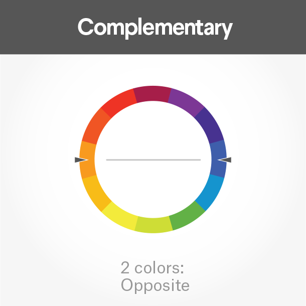
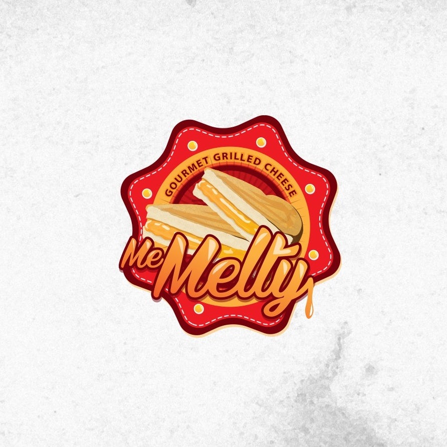
Complementary color schemes
“Complementary” is a funny term for this color scheme because the colors actually contrast sharply. Think red and green, blue and orange, yellow and purple—colors that are opposite each other on the color wheel. Putting these colors next to each other immediately makes your logo striking and eye-catching.
A word of caution: don’t split your logo evenly between two colors. Your eye needs an opposite color for a visual break. If you split them 50/50, neither color is dominant, which stresses your vision.


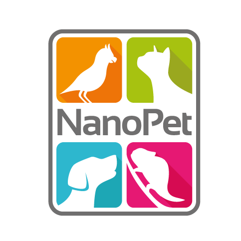
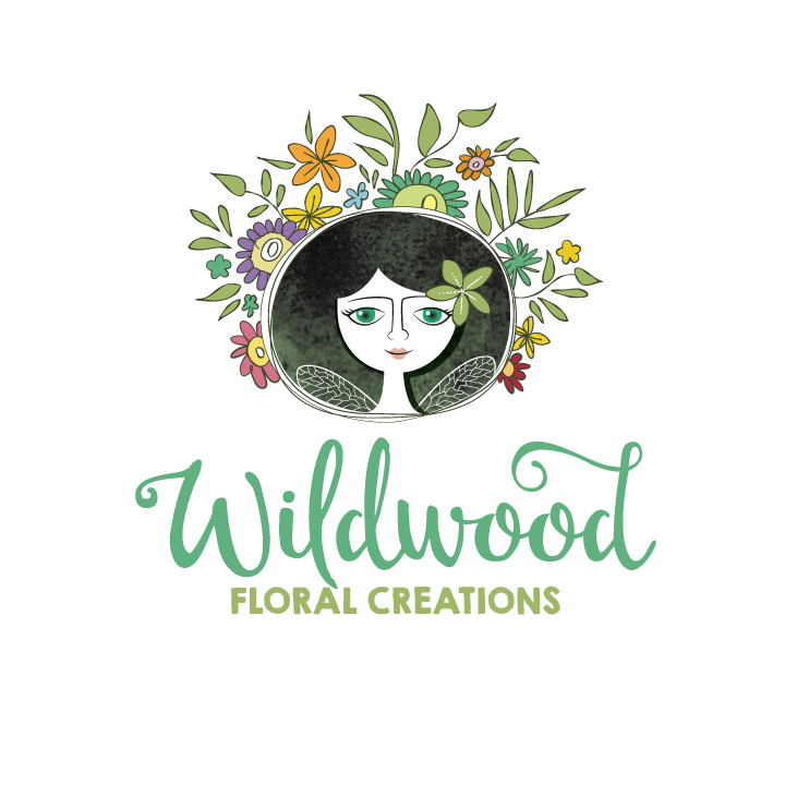
Triadic color schemes
Maybe two colors aren’t enough for you? If you really want a colorful logo, a triadic scheme might be the way for you.
As with complementary colors, triadic colors create a dynamic contrast that pops off the page. It also gives more variety of color just like analogous schemes do.
Don’t feel limited to just three colors; the same principle works with four colors. Simply choose two sets of complementary colors, spaced evenly to create a square (or even rectangle) on the color wheel.


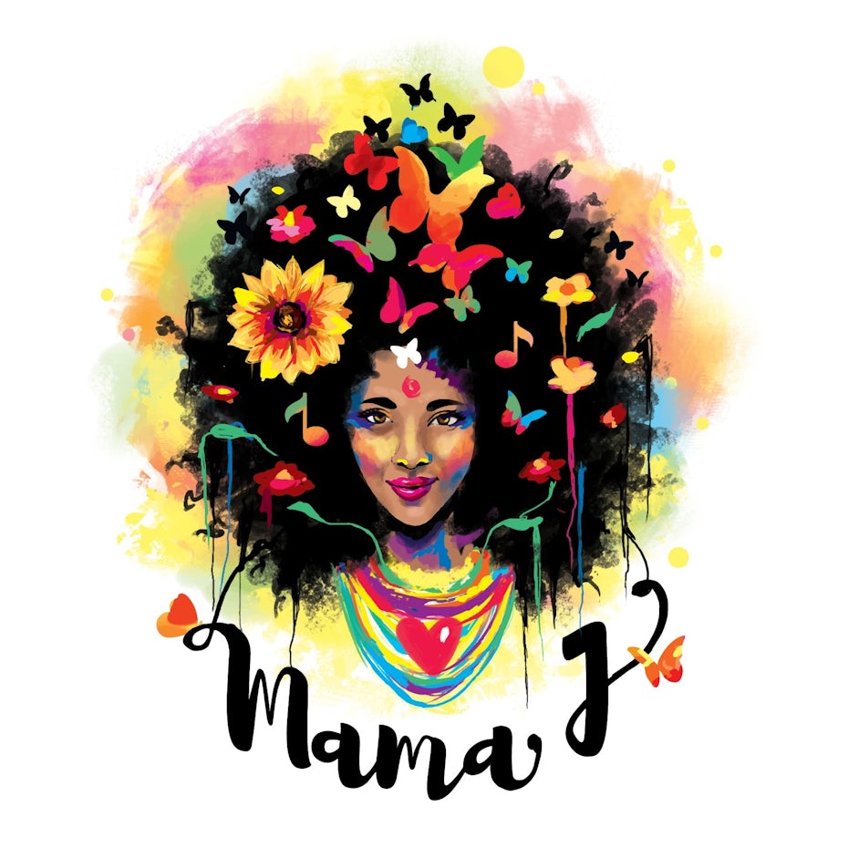
Naturalistic color schemes
The above styles work quite well for abstract or cartoon designs. What if you’re aiming for something a bit more real (without being photorealistic), though?
One way to accomplish this is to choose naturalistic colors that match the hue of the object you’re depicting. From there, you can shade or tint the color, adjusting its vibrance to make it really pop.
Take the flowers in the Mama J logo below. Flowers and butterflies are certainly multicolored, but they’re not usually quite so bright. Or look at the Friends of Noyes Park logo. I’ve never seen a tree that’s that particular shade of green. No one is going to mistake it for a photo, but by choosing naturalistic colors, the viewer can still identify the green oval as a tree. It’s a universally understood representation.


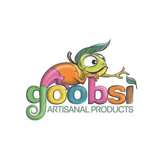
Rainbow color schemes
—
If that’s not colorful enough for you, why not just go for the whole rainbow?
Literally fill your logo with color.
Don’t just arbitrarily slap colors together like a Jackson Pollock painting. This inspirational section comes last so you can use the knowledge you’ve already learned in this article: place complementary colors together in the design, use the principles of analogous colors to guide the eye to the important parts of the logo and, of course, consider how to convey naturalism if your logo depicts real objects.
Even the most colorful logos will feel cohesive and eye-catching at the same time if they’re arranged carefully.


You can’t go wrong with colorful logos
—
So, you ask, should I avoid lots of colors in your logo? Far from it! Colorful logos work well for many types of businesses and organizations. Your best bet is to find a color scheme that fits your brand, and run with it. Your audience won’t be far behind.
Need a colorful logo for your brand?
We've got a full spectrum of designers ready for you. Any industry, any style.
This article was originally published in 2018. It has been updated with new examples and information.
The post 40 colorful logos that are brighter than the rainbow appeared first on 99designs.